Last Thursday (9/5), I headed to the Museum of Modern Art, and for the first time, brought along my trusty little digital camera.
MOMA is the world's first, and still the world's best, museum devoted to modern art; defined as art from the late 19th century beginning with Impressionism to now. Walking through there is like walking through an art history textbook. There are so many very famous and momentous works of art from the last 150 years filling its permanent collection.
MOMA, like the L train, is always crowded. This last Thursday, it was a little less crowded than usual; probably because of the Jewish holy day combined with the end of European vacation season.
Except for a few historical pictures, these are all my photos. As always, everyone (especially educators) is welcome to take anything that they see useful here.
I begin with the most famous painting in the museum, Vincent Van Gogh's
Starry Night. There is always a crowd of tourists with cameras around this painting.
This looks like a big crowd around
Starry Night, but it really isn't. Usually the crowd is so large and so dense that you can't get near the painting.
Last Thursday, people could get close enough to
Starry Night to take some decent pictures.
Here is my photo of the original
Starry Night. Vincent Van Gogh probably painted this in his room at the hospital of Saint Remy with Paul Trabuc, a hospital attendant who Van Gogh befriended, watching. I've always noticed that the edges of the painting are not flush with the frame. I suspect that the canvas was originally badly stretched. Or, the painting was made in haste. Van Gogh worked furiously during his periods of lucidity. He never knew when his illness would send him hallucinating and convulsing again. Trabuc was always there when he painted for reasons of safety; during his seizures, Van Gogh would eat his paint and try to cut himself.
I was able to take some decent detail pictures of the
Starry Night.
Here's the crowd around MOMA's other super-duper famous picture, Picasso's
Les Demoiselles d'Avignon of 1907. It's hard to believe that this painting is now 106 years old.
A girl in front of Picasso's savage picture. The textbooks all agree, modern painting and design began with this picture. Picasso took up the poet Charles Baudelaire's challenge to artists from decades earlier to make a great and compelling work of art out of a whorehouse. There is a lot of scholarly argument over which whorehouse was the inspiration for this work (Picasso frequented a lot of them in Paris and Barcelona). In this painting, the mademoiselles parade their wares before a prospective customer, us. Far from making them enticing and seductive, Picasso makes them aggressive and violent -- not just the figures but the forms of the painting. For the first time ever, the distinction between figure and ground, foreground and background starts to break apart.


You could cut yourself on the forms in this painting, including the background draperies. Picasso himself felt unnerved by the violence of this painting. He did not show it publicly until 1916, nine years after he finished working on it. He referred to this painting as his "exorcism." This painting is formed out of violence; the violence of sexual passion, of sexual commerce, of the artist's own misogynistic terror of being devoured by the very women he sought to conquer (Picasso's fear of venereal disease certainly informs this painting). For the first time in Western art, violence, disruption, dissolution, disharmony become a central part of the power of a work of art; the disruptions and dislocations of modern life as the life force.

Picasso was not the first artist to incorporate African influences in his work. The German Expressionists beat him to it by a couple of years. But he was the first to fully appreciate and to use the extraordinary liberty African sculpture takes with the human form; more so than any other culture. African art simplifies, distorts, or turns inside out the human face, reversing naturalistic relations between concave and convex, mass and volume. For Picasso, this breaking up of form was "savagery," the creation of people that he imagined lived entirely by instinct. We now see that as a very imperial view of Africa little different from the common currency of most of the rest of Europe at the time. Compared to this painting, African art looks staid and liturgical. Its distortions are the creation of inherited tradition and ideas about the spiritual realm.

Picasso incorporated the influences of his native Spain in this work as well. El Greco's emotionalism and his distortions of space and of form had a profound influence on Picasso.
Les Demoiselles was directly inspired by
a work by El Greco that he saw in private collection in Paris (and is now in New York uptown at the Metropolitan Museum). The staring faces of these figures, and the very simplified planes of the one on the left, may reflect the influence of ancient Iberian sculpture which Picasso saw in the Louvre. All of these ancient influences inform a painting that Picasso hoped would fulfill Baudelaire's criteria for a "painter of modern life," making a rich and powerful art out of modern experience.
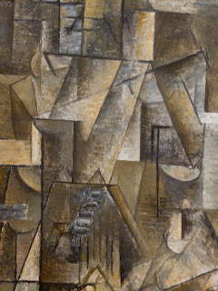
Picasso,
Ma Jolie, 1912; a textbook classic of Cubism, a coded portrait of his new mistress Eva Gouel.
If you look carefully at this detail from Ma Jolie, you can see Eva Gouel's breast and nipple. Picasso loved puzzle pictures with hidden double images. He was also fascinated with that still new invention, the X-ray. Picasso loved how X-rays revealed what was inside without destroying objects; a kind of light that passes through solids without destroying them. The fact that X-ray photographs also required expert interpretation fascinated Picasso.
Picasso was still seeing the soon to be discarded Fernande Olivier while having a secret affair with Gouel.
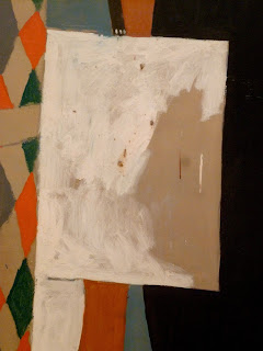
Picasso,
Harlequin, 1915. Picasso made this painting at the time his mistress Eva Gouel was dying of cancer, and some of his close friends were dying in the First World War. Picasso identified with Harlequin, a trickster who bamboozled and deceived the simple-minded; a very menacing version of Harlequin.
In Picasso's
Harlequin is a patch of raw canvas with a some thinly applied white paint. If you look closely, the raw canvas patch forms a profile of the artist.
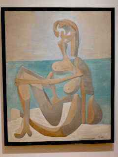
Picasso,
Seated Bather, 1930
In the 1930s, Picasso had another secret affair while he was married to the ballerina Olga Khokhlova. Picasso was 45 at the time he began the affair with the 17 year old Marie Therese Walter. He would have a daughter, Maya, with her. The affair was very intensely sexual and inspired a host of paintings and sculptures. Most were about his sexual passion for this girl. Others, like this painting, expressed his barely suppressed anxieties about being devoured by the objects of his sexual passion.
A detail from Picasso's
Seated Bather. Picasso remakes Marie Therese into a bony mantis with the head transformed into something between mandibles and a bear trap.
Here is a photo of Marie Therese from about the time she began her affair with Picasso.
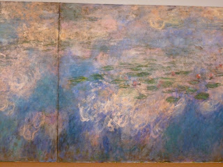
MOMA has one of the finest sets of Monet's large
Waterlilies paintings, a very late one from about 1920. These paintings began with Monet's fascination with the effect of the clouds reflected in the lilly ponds of his estate in Giverny outside Paris. That fascination turned into a series of enormous triptych paintings like this one.
It is wonderful to see this painting properly installed again. When MOMA re-opened after the latest rebuilding, this painting hung in the huge new atrium diminishing its size. The very poor lighting in that huge room made this magnificent painting look like mucus.
Here is a photo of the elderly Claude Monet at work on a Waterlilies triptych in his studio on his estate at Giverny sometime in the early 20th century.
A detail from Monet's
Waterlilies.
Another detail from the
Waterlilies; these huge paintings are vast center-less fields of flickering nuances of light a color.
A close up of one of those nuances in Monet's
Waterlilies.
A woman in a floppy hat stands before Matisse's
The Red Studio from 1911.
My pic of Matisse's
Red Studio. This is one of those paintings that gets better as I get older. Matisse transforms his own studio into a paradise of fulfilled desire and harmony. This painting uses red in a very unusual way. Most artists use red very sparingly. It is a color that calls attention to itself. There's a reason why red is used in stop lights. Here Matisse uses a rich dark red as a background color that obliterates almost everything in his studio except the works of art, and other objects of pleasure in the room. The red both separates each and every object in the room, and ties them all together in a harmonious composition.
A detail from Matisse's
Red Studio.
Another detail from Matisse's
Red Studio. I love how the shape of the chair rhymes subtly with the small plant in a bottle across the painting.
Henri Matisse,
Goldfish and Palette, 1914
This is from that period of crisis and experiment in Matisse's work where black comes back to his palette and plays a big role in his pictures, and where they begin to become more abstract. This is almost certainly due to the influence of his young rival, Pablo Picasso, whose work made Matisse seriously rethink his own.
Matisse's work up until this point had always been about resolution and harmony. Now his paintings became dissonant with broken forms, the inversion of background and foreground, figure and ground became indistinguishable; the influence of Cubism. His paintings were no longer resolved. It's as though he went to great lengths to destroy his own aesthetic, editing it with big planes of black paint, and then scratching into them to retrieve lost parts of his work.
Henri Matisse, detail from
Goldfish and Palette.
If you look closely, you can see Matisse's hand holding a palette with his thumb sticking through the hole.
Matisse,
The Piano Lesson, 1916; another old favorite of mine.
Aleksander Rodchenko,
Spatial Construction, 1920.
So much of modern art before World War II is about great expectations, about a hoped for better tomorrow. Russian artists around the time of the 1917 Revolution worked with an almost religious fervor to give form to a new world of science and technology rising out of the middle of a country that was still largely medieval. Rodchenko made sculptures out of construction materials rather than traditional stone or bronze. He constructed his work rather than carved or cast it. Instead of standing still on a pedestal, this sculpture hangs from the ceiling and is moved by air currents. As in a Cubist painting, there is no more clear boundary between the object and its surrounding space. They are continuous with one another.
Rodchenko intended works like this to be the preliminaries to design; the seed from which new types of architecture, furniture, machinery, etc. would emerge.
Aleksandr Rodchenko,
Black on Black, 1918
A very dramatic work of abstraction even though drama was the last thing Rodchenko wanted.
El Lissitzky,
PROUN 19D, 1920
The title is an acronym for the Russian phrase for "Project for Affirming the New." This magnificent abstract collage made from industrial materials (plywood, cardboard, sandpaper, etc.) was Lissitsky's vision of a bold new world even as the future of the Bolshevik Revolution was in doubt in the civil war that followed the 1917 coup. Lissitzky studied architecture in Germany. This collage is not about imagery or stories, but like Rodchenko's hanging sculpture, it is intended to be a kind of seed from which new forms in architecture could grow.
The short-lived Russian avant-garde around the beginning years of the Soviet Union was the most advanced in the world in its efforts to merge design with technology and industry. Its influence around the world would far outlast it after Stalin shut it all down in 1930 and sent its artists and designers fleeing into exile, or had them arrested and shot.
A detail from El Lissitzky's collage
A splendid early abstraction from 1912 by Mikhail Larionov,
Rayonist Composition: Domination of Red. Russian artists were already painting fully abstract work before the outbreak of the First World War, and before anyone else.
I have little sympathy for utopian ideological movements, but the fervor and pioneering spirit in these earliest abstract works is hard to ignore. To my mind, some of these works at the very beginnings of modern design, remain some of the best and most exciting ever.
The Russians would have a huge international impact, especially in Germany where the architect Walter Gropius founded a new design school with the sponsorship of the Weimar government and German industrialists, the Bauhaus. In a country with a huge population of newly poor people, German industrialists and the German government were keenly interested in design for products that were cheap to produce in bulk and cheap to sell, that were designed with a vision of a technological future in mind.
An electric lamp designed by Wilhelm Wagenfeld of the Bauhaus in the 1920s. MOMA has a large collection of items manufactured in the Bauhaus.
MOMA devotes the entire 3rd floor to design and architecture from the late 19th to the 21st centuries. This is the most densely exhibited part of the museum; too dense in my opinion. There are so many wonderful things on this floor placed so close together that they begin to cancel each other out.
The great Bauhaus designer Marianne Brandt made these 2 ash trays from an age when smoking was much more common, from the 1920s.
The Bauhaus invented stackable furniture; in this case, steel tube tables designed by Marcel Breuer in the 1920s.
Lazlo Moholy-Nagy's apartment on the Bauhaus campus in Dessau photographed in 1927. You can see a Wagenfeld lamp and Marcel Breuer's tubular furniture, including one of the stackable tables in this picture.
A Tugendhat table designed by architect Mies Van Der Rohe, the last president of the Bauhaus. This table is a magnificent design, but unfortunately you get a glimpse here of the crowding in MOMA's design galleries.
Visitors in a darkened gallery in MOMA showing on 3 walls some mechanical aesthetic film from the 1930s.
Max Beckmann ain't cool again. His most famous painting,
The Departure, is back to hanging in a staircase. I first saw it hanging in a MOMA staircase in 1982. About 15 years ago, this painting dominated a small gallery devoted to art from World War II. Now, Beckmann has come full circle.
Kurt Schwitters,
The Cherry Picture, 1921
An oil painting collage very different in spirit from El Lissitzky's abstract collage. Schwitters collected the small detritus that modern Hannover in Germany shed every day like a snake shedding its skin. The memories and stories that these fragments conveyed about the life of the city fascinated Schwitters. He incorporated them into beautifully made Cubist inspired paintings like this.
A detail from Schwitter's
The Cherry Picture; the photo is taken from an oblique angle to show the materials incorporated into the painting.
My all time favorite Surrealist object, Meret Oppenheim's
Object, 1936. She covered an ordinary tea cup, saucer, and spoon in silver fox fur making the ordinary extraordinay ... and very very suggestive.
A famous Surrealist object by Man Ray,
Indestructible Object, a 1964 replica by the artist of a 1923 original,
Object to be Destroyed.
Piet Mondrian,
Tableau I: Lozenge with Four Lines and Gray, 1926
It may seem a strange thing for a figurative painter to confess, but I am a fan of Mondrian's work. I don't think I fully appreciated it until I had something like classical training in art. His work is deceptively simple and does not always reproduce well. Those very spare compositions look like fabric pattern in reproduction when in fact they are completely painted, including the areas of white.
Many of his pictures begin with the Golden Section ("The Divine Ratio") first described by Euclid.
This painting is a beautifully elegant solution to a difficult compositional problem; how to make a relatively stable composition on an unstable form.
For all you Byzantinophiles, Mondrian's work is as deeply spiritual as any icon. He reduces our experience of the world to its most universal essences; the right angle of the tree against the level horizon of the sea. Mondrian believed that the spiritual lived and revealed itself in such universal essences. Mondrian's spirituality is Theosophy rather than Christianity.
One of the great moments in abstract painting; Piet Mondrian's
Broadway Boogie Woogie from 1943.
This was one of Mondrian's last works before his sudden death from a heart attack in 1944.
Mondrian gets rid of the black lines and lets the 3 primary colors do all the work. He comes up with a brilliant evocation of syncopated rhythm.
Mondrian painting
Broadway Boogie Woogie in his studio in New York in 1943.
For Mondrian, this is a remarkably improvisational painting. He cut out and moved squares of construction paper (as he is seen doing here) until he got something that he wanted. He would remove the construction paper squares and paint in their colors.
Detail from Mondrian's
Broadway Boogie Woogie.
This very austere Dutchman loved New York. He arrived a war refugee, his studios bombed twice, first in the German invasion of the Netherlands and again in the London blitz. He was relieved and delighted to be so far away from the Nazis and the fighting. In New York, he discovered jazz and a love for going out dancing. That joy remains beautifully expressed in this very great painting.
Mondrian was distantly associated with a Dutch design movement De Stijl ("The Style). De Stijl wanted to take Mondrian's ideas about universal essences of form and apply them to design. Here is a chair designed and built by Gerrit Rietveld in 1923.
I couldn't imagine sitting in such a thing for more than 10 seconds.
Arshile Gorky,
Diary of a Seducer, 1945
I love Gorky, what a great painter!
Gorky,
Diary of a Seducer, detail
A beautiful counterpoint between color and line; a beautifully composed picture made up of abstract forms based on biology, suggestive of everything from microscopic life to flowers to genitals.
Here is De Kooning's very famous
Woman I smiling and snarling on the wall.
Here is my close up of De Kooning's
Woman I; De Kooning worked very hard to get that smiling snarl right.
MOMA visitors before a Jackson Pollock painting.
Jasper John's
Flag that is not a flag, from 1955.
Johns'
Flag is made up of 3 separate pieces of canvas on plywood. He covered the panel with torn up pieces of newspaper and used encaustic, pigment mixed with melted wax that goes back to ancient times. Johns said that he made the painting after having a dream about painting the American Flag the night before. He ended up making a pioneering work of Pop Art in the midst of the heyday of Abstract Expressionism.
Andy Warhol's
Gold Marilyn Monroe from 1962, the year of her death. This was one of Warhol's first Marilyn paintings. Warhol grew up an Eastern Rite Catholic in Pittsburgh, and was a sickly and very lonely gay boy from a blue collar family who found his solace in Hollywood fan magazines. Those 2 influences shape this picture; a picture about adoration that combines modern celebrity worship with memories of Byzantine icons. In all of Warhol's Marilyn pictures, he uses the same publicity photo silk-screened and hand colored as we see here.
DeWain Valentine,
Triple Red Metal Flake -- Black Edge, 1966
In a really fine label essay, MOMA points out that Minimalism from the 1960s and 1970s paralleled the height of the American automobile infatuation. The 60s and 70s were the age of the big powerful V8 engined luxury cars and muscle cars with their lovingly finished surfaces. The big simple shapes of Minimalist sculptures had brightly colored highly finished surfaces just like cars. This is a great example with its cherry-red glitter finishing. Minimalism was probably the very last modern art movement to revel in the machine aesthetic.
Donald Judd,
Stack, 1967
A work by the most famous of the Minimalist sculptors. Donald Judd wanted to de-personalize art, a last gasp of a machine aesthetic pioneered by the Russians 50 years earlier. Like the Russians, Judd wanted to end the distinction between art-making and manufacturing. Unlike the Russians, there is no great shining Utopian vision driving his work (something that some of us miss in late 20th century modernism, and a reason why some of us find so much of it academic and dull).
Detail from Donald Judd's
Stack; Judd usually contracted out these sculptures to metal shops, sometimes to auto-body shops, to make. As in DeWain Valentine's work, Judd's metal boxes are finished with a brightly colored polished lacquer surface, just like a big 1967 Cadillac DeVille.
Richard Serra,
Delineator, 1974 - 1975
A big grand work by the most durable of the Minimalist sculptors. There is one big Corten steel plate above, and one below. It's the only piece in the museum with a label encouraging people to walk on it.
And finally, the MOMA helicopter, a Bell 47D1 helicopter designed by Arthur Young in 1947, and manufactured by Bell until 1973. At the time it came out, this design was widely praised by critics and pilots for its simplicity and lightness of design, especially the single piece plastic bubble for the cockpit. This is a star of the 3rd floor design exhibit and always gets the attention of visitors.


