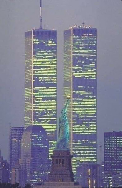
I never liked the twin towers of the old World Trade Center much, nor did I really hate them much either. They were big incommunicative presences over the city. They were huge but had nothing to say. They didn’t really dominate because they never commanded. They just took up a lot of space on the ground and in the skyline. Kids loved them because they were so simple and memorable in form. Advertisers and logo designers loved them for the same reason. I saw them daily, especially during the two years I worked in the World Trade Center Borders. Like a lot of New Yorkers, I miss them now that they are gone. I’m not sure if it’s the buildings I miss or the memories of a less angry and traumatized city. Or maybe I just miss being younger. It’s probably all those things, and like most other long-time residents in New York, those personal losses are wrapped up with the loss of the buildings. And so, on September 11 we remember the Twin Towers like we recall old friends and family on anniversaries of their passing. They were big presences, neither friendly nor hostile looming above the city visible from everywhere.
From 1996 to 1998 I knew the towers up close when I worked in the magazines department of the Borders store. I’d travel through the complex every morning with a two-wheeler to pick up the day’s shipments of magazines and newspapers. The Towers and the WTC complex around them looked a lot better up close than they did from a distance. That’s the opposite of the Empire State Building that still has one of the most stirring building profiles ever. I never get tired of seeing the Empire State Building towering over midtown. Up close, it’s a little disappointing. The detailing is rather dull and repetitive, in part because so much of it was machine made and stamped out. That’s such a contrast to the amazing detailing on other Art Deco monuments like the Chrysler Building and Rockefeller Center. And it’s a contrast to the old World Trade Center. The up-close detailing of the building was still machine-made and stamped out like that on the Empire State Building, but it was certainly not dull. In fact, it was elegant and in the smaller buildings worked well with the street traffic around the buildings. The detailing and street level design saved the World Trade Center from its own brutal self. These vastly out-of-scale buildings should have been soul-crushingly brutal, but they were not. What should have been a barren empty plaza in front of the buildings I remember as being always crowded with tourists and employees on break. That the buildings up close did not crush all who approached them and that the central plaza seemed so welcoming is entirely the work of the World Trade Center’s architect, Minoru Yamasaki.

The ground floor of the World Trade Center with Fritz Koenig's The Sphere from 1971. It is now very battered, but still on display in Liberty Park near its original site.
Detail from the ground floor articulation of the World Trade Center towers.
Ground floor lobby
Ground floor lobby
Some of the steel and chrome tracery at the top of the North Tower during the final stages of construction in 1973 with two construction workers in the foreground.
The former #5 World Trade Center where the Borders Books was located where I worked for 2 years.
The former #4 World Trade Center
A proposed design by Skidmore Owings and Merrill from 1960 for the first planned site of the WTC on the lower East Side near the South Street Seaport.
The idea of a world trade center in New York City was first proposed and then legislated by the state government in 1943. David and Nelson Rockefeller were the driving forces behind its creation and construction. The Port Authority was to own and manage the complex.
The state government of New Jersey objected to this site. They pointed out that the Port Authority belongs to the governors of both New York and New Jersey and said that their tax payers would rightfully object to paying for a big project that benefitted only New York. The Port Authority decided to move the site to the lower West Side and combine it with a commuter rail hub serving New Jersey.
Berenice Abbott's photo of Radio Row from 1936
The World Trade Center construction destroyed a large part of the original lower West Side. Radio Row was a large district full of small scale electronics dealerships and repair shops dating back to 1920. The businesses in Radio Row resisted the eminent domain decree, but ultimately lost in court.
The former St. Nicholas Greek Orthodox Church, a tenement church that was the sole remnant of a Greek and Syrian neighborhood on the site. Until it was destroyed on 9/11, it stood alone in the middle of the WTC parking lot.
Now, that destroyed tenement church of St. Nicholas is replaced by a much larger and grander church designed by Santiago Calatrava and due to be open sometime this year.
Minoru Yamasaki with a huge construction model of the World Trade Center, about 1964
A woman looking at a smaller display model in 1964.
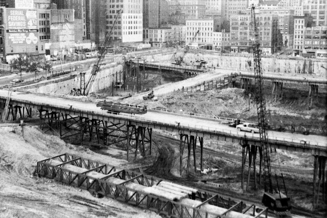
Excavation of the World Trade Center site in 1968. The WTC was built partly on original Manhattan bedrock and partly on old landfill from numerous extensions of the land into the Hudson River down through history.
The great slurry wall known as "the bathtub" on the right. It kept river water from seeping into the construction site. It is the sole survivor of the original WTC construction still doing its original job of holding back the river.
On the left is the South Tower under construction.
Construction in 1969.
Construction in 1971
Minoru Yamasaki used architectural history to serve an optimistic vision of the future, an American future. The ribbed vaulting and tracery of Islamic and Gothic architecture influenced Yamasaki continuously throughout his career. He adapted its design and structural ideas to new materials such as steel and reinforced concrete, and certainly to new uses. He used past forms to create an architecture that looked forward to the future. Louis Kahn used ancient Roman building forms and materials to create an architecture for the ages, to be timeless. Yamasaki designed buildings to encourage people to imagine the future. Visions of the future never age well, and a lot of Yamasaki’s buildings have a quaintness that comes with long past imaginings of the World of Tomorrow. It’s no accident that the current fashion for what is now called Mid-Century Modern drives a revival of interest in Yamasaki’s work. Like much of Mid-Century Modern design, his buildings have the nostalgic cachet of the American Empire in its glowing sunset on the eve of the Vietnam War.
Other buildings by Minoru Yamasaki:
One Woodward Avenue
(formerly Michigan Consolidated Gas Building),
Detroit, 1962
One of his best office buildings in my opinion.
I think this glass entrance lobby is outstanding. Yamasaki had a great feel for the transition from the street to the building interior.
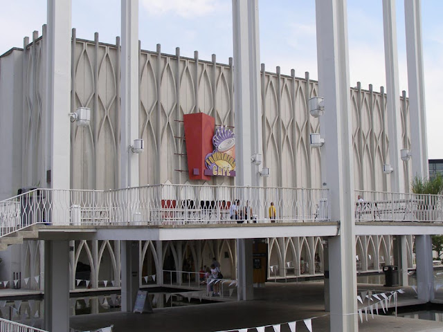
Pacific Science Center, Seattle, 1962
A great centerpiece, an unexpected re-use of a historic building unit, a four arch bay with a lattice vault, something out of both Islamic and Gothic architecture. The medieval past remade to point to a promised future.
Lambert-St.Louis International Airport, St. Louis, 1956
Another great remaking of a traditional building form -- a groined vault -- to anticipate the future.
A photo taken during construction in 1955.
North Shore Congregation Israel, Glencoe, Illinois, 1964
I don't know, but I doubt Yamasaki was a very religious man. Yet he designed some beautiful religious buildings. Among the best is this synagogue.
Minoru Yamasaki on the cover of Time magazine, January 28, 1963
illustration by Boris Artzybasheff
Minoru Yamasaki was an extraordinary man who overcame many hardships including racism and poverty to make a very successful career as an architect. He was born in Seattle in 1912 to Isei Japanese immigrant parents. He first studied architecture at the University of Washington where his talents were recognized. He worked five summers in a salmon cannery in Alaska to help pay for his education. He traveled east to New York hoping to find opportunity and some relief from the pervasive anti-Asian racism in the American west at the time. He packed dishes for an import/export company making a small and precarious living while pursuing a master’s degree in architecture at New York University. He went to work for the firm of Shreve and Lamb that designed the Empire State Building, very notable since he would design the first buildings to top out that once celebrated Tallest Building In The World. It’s also notable that this architect of a Tallest Building in the World had a fear of heights. Some speculate that acrophobia may have played a role in the design of the World Trade Center towers.
It was Shreve and Lamb that protected Yamasaki and his parents from deportation during World War II.
After the war, Yamasaki became internationally famous and in demand as an architect. Not all his buildings were successes. He designed the Pruitt Igoe houses in St. Louis, a notorious fiasco. Most of his projects however were successes with lasting reputations. He died of cancer in 1986 in Detroit.


