Another post that is two years late, but here it is.
In Amsterdam in 2016, I once again visited the Rijksmuseum that I wrote about much more extensively after my first trip in 2014.
I visited the Van Gogh Museum where no photography is allowed.
And I visited the Stedelijk Museum, the modern art gallery of Amsterdam.
All photos are mine unless otherwise indicated. They are freely available, especially to educators.


Modern art galleries may be unique on the outside, but they're all the same on the inside. If I didn't know this was in Amsterdam, I'd have no idea where I was.
While at the Stedelijk, I had an epiphany with this painting from the very first moment I laid eyes on it, Barnett Newman's Cathedral, 1951.

Alas, my photos do not do it justice. The blue in this painting is a rich luminous layered blue that is like nothing I've ever seen before. Newman built up this blue, layer upon scumbled and glazed layer.
I was bowled over. I've never had an experience like that with a painting by Barnett Newman before.

Newman's signature stripe flashed like a bolt lightning in the vast blue space of the painting.

I've always known Barnett Newman's work, but never really thought much of it until now. His most famous painting Vir Heroicus Sublimis from about the same time as this painting always struck me as a bore with a corny title. Since looking at this painting, I will have to re-assess my opinions about Barnett Newman.
There were a number of works by the great Dutch - American artist Willem De Kooning

A favorite of mine, Rosy Fingered Dawn at Louise Point, 1963


And a fine example of De Kooning's very late work that I think is still underrated.

Works by Piet Mondrian and the De Stijl movement of the 1920s starred in the collection


One of Mondrian's more familiar grid abstractions. These began in Mondrian's deeply held spiritual beliefs rooted in the Theosophical movement founded by Helena Blavatsky, that true reality was the eternal unchanging world of idea that lay behind the fleeting world of appearances. Mondrian's grid paintings begin with Pythagoras' epiphany when he saw the vertical line of a tree against the horizon of the sea, that the fundamental structure of the world is geometry and number. Mondrian takes Pythagoras' experience out of the realm of landscape and simplifies all visual experience to its most fundamental components, vertical and horizontal lines, black and white, and the three primary colors in deceptively simple compositions that begin with the Golden Section.

Two of Theo Van Doesburg's beautiful gouache abstractions that he intended to be generators of design forms for architecture and furniture.
De Stijl, like Mondrian, wanted to reduce design to its most fundamental components. Unlike Mondrian, the De Stijl designers were not mystics. They wanted to make a kind of universal design language through reductivism; vertical and horizontal, black and white, and the three primary colors meeting in a kind of three dimensional grid.

The craftsman and architect Gerrit Rietveld applied those De Stijl design ideas to actual furniture and architecture. The Stedelijk owns a generous collection of Rietveld's work.

Gerrit Rietveld started as a furniture and cabinet maker in his native Utrecht. He created the Red Blue Chair to be a design for mass production. The Chair originally started out as a white color in 1917 (the Museum has one of those as illustrated below). Under the influence of De Stijl, Rietveld began coloring these chairs in the three primary colors in 1919.

These Rietveld chairs are marvelous things to look at, but I wonder how well they worked as furniture. These chairs do not look the least bit comfortable. Alas, the human body and living forms in general do not follow the contours of right angle geometry.

One of Rietveld's original 1917 chairs all in white.
The Stedelijk has a an entire bedroom designed by Gerrit Rietveld with Truus Schröder-Schräder for the Amsterdam home of a pediatrician RJ Harrenstein (who was married to Schröder-Schräder's sister). Rietveld and Schröder-Schäder designed and built the room in 1926, two years after Rietveld built the Schroder house in Utrecht. Rietveld built most of the furniture in this room, including pieces meant to fold into the wall.

As in the Schroder house, Rietveld designed and built this room applying design principles that we first see in those beautiful gouache drawings by Theo Van Doesburg.


It's a really cool looking room. I just wonder how comfortable it was for Dr. Harrenstein.

There was a special exhibit of Amsterdam Style furniture at the Stedelijk, the same design movement that Het Schip and similar housing projects came out of.


This work mostly from the first two decades of the 20th century is very different in form and spirit from what came later in the 1920s with De Stijl. Amsterdam Style is much closer in form and spirit to William Morris and Arts and Crafts by way of Art Nouveau.


The artist Charley Toroop was a real discovery for me. Her very solid figurative painting in sometimes stagey settings really impressed me. I was not surprised to discover that cinema influenced her work very much, and that one of her sons John Fernhout became a film maker.
She was the daughter of the great Dutch-Indonesian Symbolist painter Jan Toroop.


A very striking self- portrait by Charley Toroop made in 1943 during the Nazi occupation of The Netherlands.

A fine painting by the German artist Paula Modersohn-Becker.

A beautiful Rayonist abstraction by the Russian artist Natalia Goncharova,


One of my favorite works by Kazimir Malevich, the pioneering Russian abstract painter, Yellow Quadrilateral, 1917 - 1918.

A fine painting by Robert Delaunay.
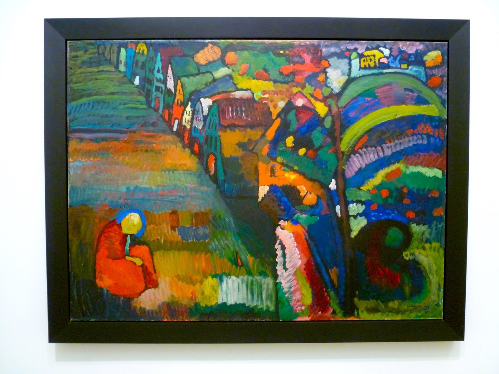
A beautiful early Wassily Kandinsky.

A work by the great Symbolist painter Odilon Redon that quotes Leonardo Da Vinci.

One of Ernst Ludwig Kirchner's now rare surviving sculptures.


A painting by Paul Jenkins. When I was in art school decades ago, professors and critics alike used to frown on his work as being just so much effect; not much different from spin art. A lot of art students like me enjoyed his work, perhaps as a guilty pleasure. Apparently, he's being rehabilitated as a major artist of color-field abstraction that dominated galleries and museums in the late 1950s early 1960s.


A famous triptych by Roy Lichtenstein, the great Pop artist.


A detail of Roy Lichtenstein's painting showing his use of Benday dots, formerly an inexpensive color printing technique used in comic books and newspaper ads. I think Benday dots are obsolete technology now.

My photos of Jeff Kienholz's The Beanery, an installation he created in 1965. I've known Kienholz's work for many years, but I'd never seen any of it in the original. I remember that American critics hated his work (though a lot of American artists liked it), but European critics loved it.
This work is a narrow dark space. Only one visitor at a time is allowed in to look. My camera doesn't do very well in the dark, and so my pictures aren't very good.
The Beanery is based on an actual place, a bar called Barney's Beanery in West Hollywood in Los Angeles, a very small place. This was long a hangout for celebrities from Judy Garland and Clark Gable to Jim Morrison and Janis Joplin. It was also a popular hangout for literary folks. Charles Bukowski frequented Barney's. Kienholz was a regular here.

The original owner of Barney's Beanery, John Anthony was famously homophobic, especially in a neighborhood like West Hollywood that always had a large gay population. He put up his notorious sign as early as the 1930s. Kienholz, who was not particularly homophobic, decided to replicate the sign in his installation, a decision that remains controversial. The original sign from Barney's Beanery now rests at ONE National Gay and Lesbian Archives in Los Angeles.
Below is a much better photo of the installation in its current state.

Another more recent and temporary installation by Jon Rafman, an artist from Montreal, Canada.

Here is the sign you saw before going in.

And here is the inside of the installation. It was certainly popular. It was a very pretty luminous set of blue rooms with a lot of entertainment like a swing (seen above), a ball pit, and a couple of video monitors with seats.


People seemed to be having a great time here. I wonder if that was really what Rafman intended. The sign outside the door seems to indicate otherwise.

As beautiful as this blue room was, it still wasn't nearly as rich and beautiful as Barnett Newman's painting Cathedral.
1 comment:
I'm happy to find that you admire those late De Kooning works. I thought they were quite lovely and touching when I saw a number of them at the SLAM a decade or so ago.
Post a Comment