Natural Blue

The color blue begins with the sky. The nitrogen and oxygen that make up much of the atmosphere absorb the long light waves of red and scatter and reflect back the short light waves of blue. We live at the bottom of a sea of blue air. Sunlight that comes through that air at mid day is very cool and bluish in color.

At sunrise and sunset, sunlight passes over the surface of the earth at a tangent and through much more atmosphere. The air does the opposite at this time of day absorbing the short light waves of blue and reflecting back the long waves of red.

The same effect is true of water, especially over tropical seas.

The combination of air and water make ours a blue world.
And yet, blue remains an exceptional color in the natural world of life and minerals. Warm colors of reds, browns, umbers, and ochers dominate the colors of the land. The colors of life are primarily greens, reds, and browns.


Sodalite


Egyptian Blue

The Egyptians made the first synthetic color, a blue that the Romans later called Egyptian Blue. The ingredients were simple, but the process of making it was demanding and difficult. The Egyptians used chalk or limestone together with a blue mineral such as malachite or azurite, and sand. These were melted together at very high temperatures. Not only temperature, but the amount of oxygen used in the firing determined the resulting color from deep dark ultramarine blues to bright almost greenish turquoise colors. Making this pigment required great skill.
The Egyptians loved blue associating it with the sky and the waters of the Nile.


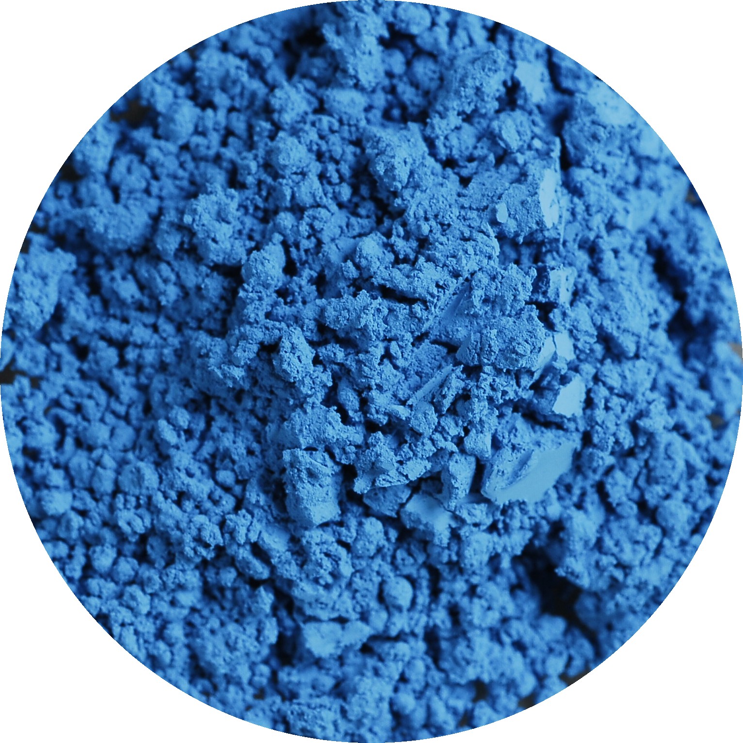
Ultramarine Blue

For many centuries, ultramarine blue was the most expensive and sought after pigment in the world. Throughout much of history, artists made ultramarine blue out of lapis lazuli mined from Sar-e-Sang in the Hindu Kush mountains in what is now Afghanistan near the famous Buddhist site of Bamiyan along the Silk Road. Merchants transported lapis on the backs of camels and donkeys along the silk road to sea ports in Syria. From there, ships carried the mineral to Venice. Ultramarine blue made from this lapis lazuli came from over ("ultra-") the sea ("-marine).
Not only was ultramarine blue made from very costly lapis lazuli imported from Central Asia, but it was extremely difficult to make. Lapis lazuli contains numerous mineral impurities from calcite to pyrite. Grinding up lapis lazuli makes a disappointing grey. Cenino Cennini in his famous 14th century artists' handbook describes a lengthy process of refinement involving mixing wax, linseed oil, and mastic into the powder, soaking it in an alkaline lye solution, and pressing it repeatedly to extract the bright blue lazulite from the matrix of mineral impurities.
The material and the process were so expensive and demanding that artists required an initial down payment from patrons in order to afford the pigment.

Enrico Scrovegni, among the richest bankers in Europe in the early 14th century, contracted the artist Giotto to make liberal use of extremely expensive ultramarine blue in the Arena Chapel in Padua. Giotto used gallons of it, applied a secco, over dry plaster so that it would not chemically react with wet plaster. Banker that he was, Enrico Scrovegni wanted to impress God and the neighbors with how much money he could afford to set on fire for this project.

By the 19th century, industrialism created new and brilliant colors that could be sold cheaply. In 1824, a French industrial society put out an award of 6000 francs for the first person to come up with a cheap synthetic way of producing ultramarine blue. In 1828, two people claimed the prize, a German chemist Gmelin who claimed to have invented a synthetic process earlier, and French chemist Jean Baptiste Guimet. Guimet walked away with the prize money and the patent rights to a process of extracting the color from coal tar. Not only was the new ultramarine blue cheap to make in large quantities, but it was more uniform in quality than the old ultramarine made from lapis lazuli.
Some artists were not impressed. They argued that the new industrial synthetic lacked the depth of the old blue precisely because it was so uniform. The new synthetic color became known as French ultramarine blue to distinguish it from the older "true" ultramarine blue.
I've never tried to make the pigment, but I did try once to make my own ultramarine blue oil paint from powdered pigment. The pigment that I bought was definitely the "French" kind and reeked of coal tar. I ground the pigment as fine as I could, mixed it with linseed oil, and put it in a paint tube. The paint dried out in the tube within an hour. Ultramarine blue remains a frustrating pigment to mix for one's self. I just buy tubes of it at the art supply store now, and thank God that I live in the 21st century.

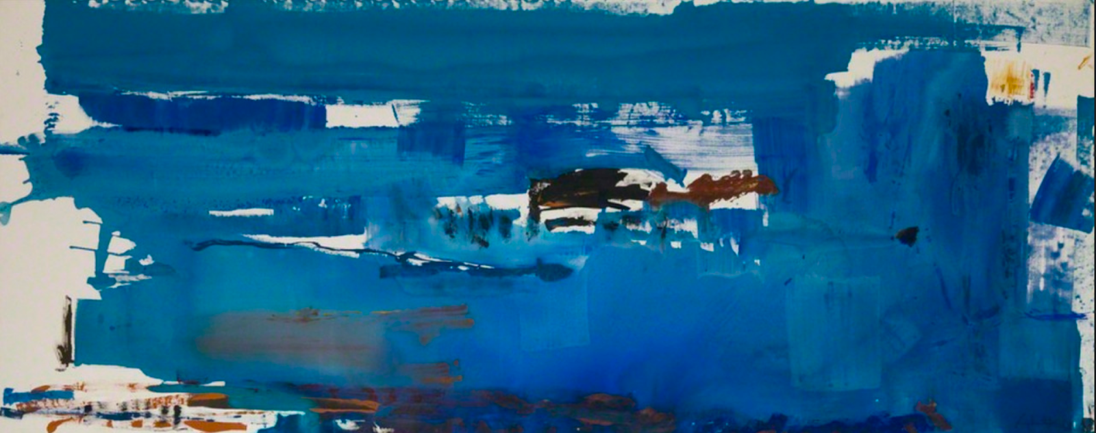
The search for a good ultramarine blue continued into the 20th century. The artist Yves Klein became obsessed with the color. Like many artists, Klein noticed that the dry blue pigment lost its original intensity when it was mixed with linseed oil and other ingredients to make it into paint. He collaborated with Edouard Adam, an art supplier to find a suitable medium that would not diminish the brilliance of the original pigment. In 1960, Klein patented what he called International Klein Blue (IKB). Above is a painting by Klein made with the new blue, L'accord bleu from 1960.
The Blue of the Virgin Mary
As early as the 12th century, the Church hierarchy decreed that the color associated with the Virgin Mary would be the color of Heaven, blue; and not just any blue, but the purest and most expensive of blues, ultramarine. The growing and burgeoning cult of the Virgin Mary created a lasting demand for her image.

In the beginning, a light safe and chemically stable ultramarine blue pigment remained elusive to Western panel painters working in egg tempera on gessoed panels. Over time, the colors in panels from the 13th and early 14th centuries frequently decayed into a greenish black as in the example above; an otherwise very fine late 13th century painting by the Badi a Isola Master.


I'm not a fan of Guido's work, but the brilliant luscious colors are hard to resist.
Cobalt Blue

Cobalt blue made from an oxide of cobalt has been used for centuries to color ceramics and glass first in China, and then in the West as early as the 12th century.
Cobalt blue the artist's pigment appeared in 1802 - 1807 in France, created as an alumina based pigment by Louis Jacques Thenard.


Iznik ware tiles from the Rustem Pasha Mosque, Istanbul, 16th century


Iznik tile work from the Mehmet Sokollu Mosque, Istanbul, 16th century


The South Rose Window, Chartres Cathedral, 13th century

Prussian Blue

The Berlin paint manufacturer Johann Jacob Diesbach made Prussian Blue, the first modern synthetic pigment by accident around 1704 to 1706. He tried to make his signature brilliant lake red when something went wrong with the mixture that turned first pink, then violet, and then a deep dark blue. Diesbach suspected his materials supplier, a chemist and pharmacist named Johann Konrad Dippel sold him some adulterated potash. It turned out that the potash contained animal oil that transformed what was supposed to be a brilliant scarlet into ferrocyanide, or Prussian blue.
Dippel began making and selling the color as a cheap substitute for ultramarine blue that had no green in it unlike smalt, azurite, and other inexpensive blues of the time, and had great tinting strength to stand up to being mixed with other colors.
The most notable use of Prussian blue was not in oil paint, but in colored inks by the great Ukiyo-e print makers of the early 19th century, in particular Hokusai and Hiroshige who made the color famous.
Stable light fast blue colors were very scarce in Japan, so these print makers turned to imported Prussian blue inks from the West.


Cerulean Blue
The Swiss chemist Albrecht Höpfner first made Cerulean blue pigment in 1789, but it did not become widely available to artists as oil paint until the 1870s.
The French call the color bleu celeste, in English it is sometimes known as "sky blue."

Claude Monet was among the first artists to take advantage of the new broad range of inexpensive brilliant colors created by industrialism. Cerulean blue forms the basis for the brilliant light filled skies in his paintings.

Claude Monet, The Four Trees (Poplars by the Canal, Evening Effect), 1891

He used those brilliant colors to make paintings based on the optical science of the day. He created a new palette of bright colors based on the spectrum as first described by Newton.

Cerulean is the "heavenly" blue. It colors the houses of Brahmans in the city of Rajasthan in India.


The flag of the United Nations adopted in December, 1946. The architect Donal McLaughlin of New York designed the symbol, a projection of the entire earth from the north pole showing all of the continents. The committee responsible for designing the flag chose cerulean blue for the color, a blue that was as far away as possible from the brilliant red so favored by the ideological tyrants of the Second World War. Cerulean is the color of the same sky seen by all of humankind.
Artists' Blue


2 comments:
What about woad?
What about indigo? or smalt? or pthalocyanine? or cyan?
Post a Comment