My! How things have changed over the course of my lifetime! It used to be that a comparison to Norman Rockwell was the height of abuse and insult among artists. I remember in 1982, Roy Slade, then the president of the Cranbrook Academy of Art, came into my studio and turned all of my paintings upside down and declared, “This is like Norman Rockwell!” He did not mean that as a compliment. Critics in those days loathed Rockwell as the antithesis of everything modern.
Today, we are informed that Steven Spielberg and George Lucas collect his work. That high temple of modernist abstraction designed by Frank Lloyd Wright to house Hilla Rebay’s Kandinskys, the Guggenheim Museum in New York, devoted its spiral ramp to exhibiting Norman Rockwell’s work a few years ago. Now critics are comparing his work favorably to Vermeer and Watteau.
Both the praise and the damnation have one big thing in common. They are both excessive and disproportionate. Norman Rockwell was never the enemy of modern art, and he ain’t no Vermeer either.
He was a brilliant and incredibly successful popular illustrator, and never claimed to be anything else. He never claimed to be a fine artist in any way, shape, or fashion. He always described himself as what he was, a commercial illustrator specializing in magazine covers. His work was always tremendously popular over many decades of a long career.
That achievement is no small thing. He worked as a fairly successful magazine illustrator since World War I. The height of his career began in the course of World War II with his covers for The Saturday Evening Post. The demand for his work remained high and only increased through the 1950s. To give you an idea of the scope of that achievement, think of what Rockwell, a painter, competed with in those days. First, he had to compete with the big glossy picture magazines like Life. In the 1950s, his popularity grew in the age of television, when his predecessors and contemporaries in commercial illustration were forgotten, artists like Coles Phillips, JC Leyendecker, and Maxfield Parrish (Rockwell’s popularity, plus the nostalgia fad of the 1970s, would restore their fame).
Rockwell, like all successful illustrators, painted fantasy, not his fantasies, but those of his audience. Maxfield Parrish painted a brilliantly colored fantasy world of legend and fairytales, the imaginative world of children and young people. Leyendecker painted a world of always confident, beautiful people, perfectly dressed no matter what the occasion whether it’s first night at the opera or a baseball game. Rockwell’s fantasy world was very close to the one his audience actually lived in, only cleaned up. What he cleaned up was not the actual physical dirt (Rockwell had no qualms about painting dirt and dilapidation), but any sense of conflict, grief, or threat. Where conflict did appear, it was silly and quaint, like boys arguing over a ball game. Families in the Second World War worried constantly about the fate of their sons and daughters fighting the war. They knew as much as they cared to know about the horrors of that war and the hardships of military life from the papers and the newsreels. Rockwell didn’t exactly give them a fantasy of distraction like Disney or Busby Berkeley. He gave them Willie Gillis, an adorably dopey GI with jug ears who slept through reveille and peeled potatoes on KP duty.
 Norman Rockwell, a Post cover featuring Willie Gillis, 1942
Private Gillis never faced combat or a vindictive officer or an intractable military bureaucracy. The point of Willie Gillis was not simply to be a white American Every-Boy, it was to reassure people that somehow all was well with their sons.
That same formula worked even better in the anxious 1950s, a decade of prosperity with a strong undercurrent of fear over everything from the Cold War to polio to racial conflict. Rockwell’s covers about suburban family life reassured people with living memories of the Depression and the War that all was well.
 Norman Rockwell, A Day in the Life of a Boy, 1957
For this reason, Rockwell was always popular with the nationalist political right. They understood Rockwell’s pictures as images of a middle class American Eden, created by the simple thrift, virtue, and toil of honest folk, and the right kind of folk who knew their place. In fact, Rockwell’s own views were always a little to the left of his most ardent admirers. The same artist who always showed Black folk as the happy servants of whites, saw desegregation coming and welcomed it. Beginning in the late 1950s, black and brown faces began appearing in his work in roles that were not subservient.
 Norman Rockwell, The Golden Rule, 1961.
By the 1960s, the Civil Rights struggles left their mark on his work.

I doubt that his most famous and celebrated works, the paintings of the Four Freedoms, would pass the right wing ideological litmus tests today. First, they are based on a speech by the much-hated-by-the-right FDR, a speech intended to remind Americans in the middle of World War II of what they are fighting for. The 4 pictures are about very un-rugged individualist virtues of cooperation, civility, community, and security. The man rising to speak in Freedom of Speech is not about to give some spittle-flecked raging rant. He's not a hot gospeler on a mission.
 Norman Rockwell, Freedom of Speech, 1943
The man rising to speak is not Glenn Beck with a blackboard, or an anarchist with a slogan. He's just a resident of the town speaking his mind on something like a local zoning ordinance. No one boos him or threatens him. There are no insulting signs. Everyone politely listens.
The parents tucking their children into bed in Freedom From Fear are modest people in a modest home (and therefore vulnerable). The newspaper headline in the father's hand speaks of war and suffering beyond the bounds of their home.
 Norman Rockwell, Freedom From Fear, 1943.
They feel safe in their assumption that not only their own efforts, but the good faith of their neighbors, their community, and their government will protect them from harm and misfortune. It’s not quite a ringing endorsement of the Welfare State, but then, it’s not exactly everyone-up-by-their-own-boot-straps self-reliance either.
Capitalism as the great agon of mighty heroes these paintings are not. Communities of friendship, trust, and mutual support made by ordinary people are what the Four Freedoms show us.
Rockwell painted for mass reproduction as well as for a mass audience. He never meant for his paintings to be seen in the original. In fact, he discarded a lot of his originals. He painted images to survive the processes of industrial printing. Those processes were not meant for the subtleties of Whistler or Velazquez. Rockwell’s illustrations featured crisp clear shapes and silhouettes with a minimal background or no background at all. His colors were usually descriptive, though sometimes bright and local. Lighting was rarely complicated. No dark dramatic tenebrism here.

Norman Rockwell, Checkup, 1957.
 Norman Rockwell, The Volunteer Firefighter.
These paintings were meant to complement text and typefaces. For this reason, for all of their microscopically detailed realism, his pictures frequently have a flat graphic quality to them, even when Rockwell paints detailed settings.
 Norman Rockwell, Girl With A Black Eye, 1953.
The attention to detail in this painting is remarkable from the girl's disheveled hair to the shine in the institutional tile floor. And yet, the principal waiting behind the door is as spaceless as a blue square in a painting by Mondrian. All the figures are bright clear shapes, as clear and distinct as the ones Rockwell painted on no background at all. Those clear hard contours always bring us right back to the surface. The contingencies of printing processes did not allow Rockwell much room to use subtle lighting and color effects to create a successful illusion of space. He was mostly limited to basic overlapping and perspective.
Another reason for their seeming flatness was Rockwell’s reliance on photographs. He claimed (too modestly) that he could not paint from imagination. He used models and all kinds of props. As we can see in the photo and painting below, he did not stick quite so literally to his models as he claimed.
 Norman Rockwell, The Tattooist, 1929 with a photo of a model taken by Rockwell to the left.
Frequently, he photographed his models instead of forcing them to hold awkward poses. He found photography to be especially expedient when painting children, as he often did. The problem with working from photographs is that the artist copies an already flat image. The arrangement of lights and darks on film replicate what we see with our eyes.
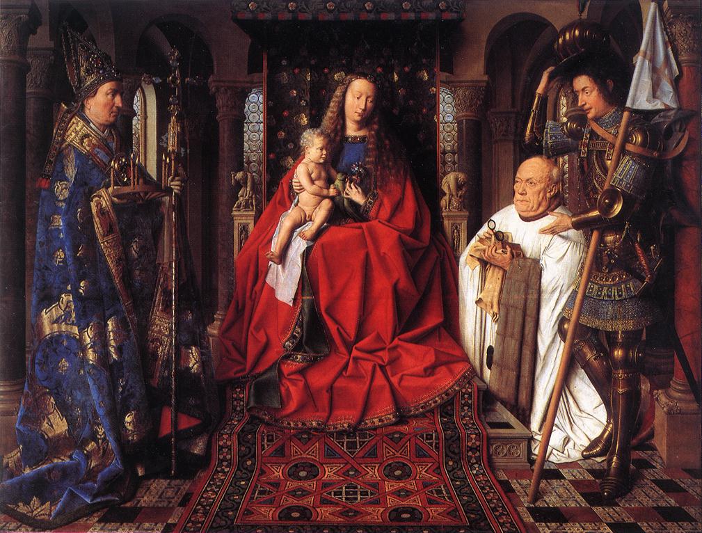
I think his paintings in the original and in reproduction to have a dry pedestrian quality to them. They are the creations of honest toil and a hard day’s work. They are neither virtuosity nor the labor of exploration and realization. His work is definitely not Jan Van Eyck sparkling with light even in the smallest details. It certainly isn’t Vermeer with his exploration of the bounds between actual visual experience and painted fiction, the recreation on canvas of a field of vision created by reflected light. Rockwell’s painting technique is that of an illustrator, a technique that served his purposes and served them well.
The stories Rockwell told with his brush are as simple and uncomplicated as his painting technique. These are stories of the commonplace made humorous and endearing, if a bit treacly.
 Norman Rockwell, The Doctor and the Doll, 1929
There is none of Watteau’s undercurrent of melancholy in Rockwell’s scenes of children and middle class people. There is no sense of the savor of delight made sweeter by the omnipresence of death and loss. There are always the games and foibles of children (as seen by adults), and the charming foibles of adults themselves presented without any complicating inflections. Within the bounds of that formula, his paintings could be very clever.
Probably the wittiest and most self-deprecating of all self-portraits must be Rockwell’s triple self-portrait.
 Norman Rockwell, Self Portrait, 1960.
He appears 3 times in the same picture, in the painting on the easel, in the mirror, and with his back to us. Everything looks very improvised from the heavy wall mirror resting on a chair to the cold drink holding the picture book open. The best part is the contrast between the confident self-possessed image materializing on the easel, and the skinny bespectacled old man struggling to paint it. The reproductions of famous self-portraits by Rembrandt, Van Gogh, Durer, and Picasso only add to the self-effacing charm of the picture. It's the image of a professional struggling to meet a deadline.
6 comments:
Rockwell is sort of Wit + Charm Uber Alles. I agree, that he (much like Christianity?) was the "property" of the Right Wing for WAAAAAY too long.
Maybe now, we can see his work for itself, w/o the framing of the Right.
We subscribed to the Saturday Evening Post when I was growing up, and I was always delighted with the Norman Rockwell covers.
The little black girl being escorted to school is iconic, and Rockwell's triple portrait is delightful in its humor at the painter's own expense.
Vermeer? I don't think so. Rockwell was wonderful as what he was - a journeyman illustrator.
Dear Doug,
This article about Norman Rockwell was just brilliant-- as is your entire blog BTW. Kitt and I have been so inspired by everything you do. I grew up with Rockwell because my Dad loved him, so it was like visiting a childhood friend and really learning about his art as an adult. Your writing and clarity about his art is pure delight.
And I must add, I loved the quote page and your list of artists.
Hannah Arendt's "The best live by legends" quote I'm commiting to memory! Wow, intelligent people are still out there!!! What a relief your blog is what an amazing achievement!!
Love,
Audrey
Thanks Audrey, and it's a pleasure to hear from you again.
Art perhaps not, but strangely moving.
I also grew up with the Post and Rockwell's painting. I have always seen him as an artist more than a simple illustrator. We saw much of his artwork at the Chicago Historical Society when it came through the Midwest, and walking through the show from his early works to his later ones I saw such a transformation.
Though his work was not the caliber of other honored painters like those you mentioned he did so much that told stories that people understood.
Through his portrait of JFK and the Civil Rights era paintings as well he showed the illustrator beginning the transformation, I think, to a true painter. Though I love his early work, I find his later work showed a real maturity that if he'd lived would have shown his true artistic talent.
Post a Comment